
Journal 7 / 2011 (Museum of Applied Art. Online)
ISSN 2466-460X (Online)
ISSN 0522-8328 (Printed edition)
PDF of the printed edition ![]() (7.4 MB)
(7.4 MB)
Editor in Chief: Ljiljana Miletić Аbramović, MA
Issue Editor: Ljiljana Miletić Аbramović, MA
Editorial Board:
Mila Gajić
Predrag Dragojević, PhD
Milica Janković, MA
Ljiljana Miletić Аbramović, MA
Jadranka Prolović, PhD
Mirjana Roter Blagojević, PhD
Issue Editorial Assistant: Jelena Popović
All the papers in the sections Contributions, Polemics, Critic Reviews and Reviews are peer reviewed.Contents of the Jouurnal 7 / 2011 (Museum of Applied Art. Online)
Impresum
Impressum
Impressum
Sadržaj
Contents
Contents
BERNARD BERTHOD
LES SOULIERS ROUGES DU PAPE, DU BASILEUS A PRADA / CRVENE PAPSKE CIPELE, OD VASILEVSA DO PRADE
PAPAL RED SHOES, FROM BASILEUS TO PRADA
PAPAL RED SHOES, FROM BASILEUS TO PRADA
Abstract (original language):
Personne n'a jamais baissé les yeux sur les souliers rouges de Paul VI ou de Jean Paul II Mais, dès 2005, la presse people a fait des gorges chaudes au sujet des souliers du pape Benoît XVI et les acteurs de la mode se sont émus. Ces souliers se détachent particulièrement sur la blancheur du vêtement papal et on fait s'interroger plus d'un spectateur ou télé spectateur. Certains journalistes ont affirmé qu'ils étaient réalisés par Prada, alors qu'ils sortent des mains d'un honnête bottier milanais. Cependant rien de plus traditionnel que ce soulier rouge, appelé mule, au pied du pontife romain. Cet usage a une longue histoire qui trouve ses racines dans l'Antiquité romaine puis à Constantinople, à la cour du Basileus au VIe siècle.
L'article rappèle l'importance de la couleur rouge dans le vestiaire papal depuis le haut moyen âge. Puis, suit une description de l'usage des souliers rouges depuis le début du IIème millénaire. Un troisième chapitre évoque l'usage à l'époque moderne et contemporaine et les modifications survenues sous le pontificat de Paul VI et se termine par la description des souliers portés par Jean Paul II et Benoît XVI.
/
Nikada niko nije oborio pogled ka crvenim cipelama Pavla VI ili Jovana Pavla II. Ali, te 2005. godine, časopis People narugao se crvenim cipelama pape Benedikta XVI, a akteri modnih zbivanja uskomešali su se. Ove cipele posebno dolaze do izražaja u odnosu na belu boju papine odeće, pa to pitanje intrigira više od jednog posmatrača ili TV gledaoca. Neki novinari potvrdili su da su cipele napravljene kod Prade, a one su u stvari delo ruku jednog časnog milanskog čizmara. Međutim, nema ničeg tradicionalnijeg od ove crvene obuće, koju zovemo papučama, na nogama rimskog pontifeksa. NJihovo korišćenje ima dugu istoriju koja svoje korene nalazi u antičkom Rimu, a zatim u Carigradu, na dvoru vasilevsa u VI veku.
Članak podseća na značaj crvene boje u papskoj garderobi, od visokog srednjeg veka. Potom sledi opis koji ukazuje na praksu nošenja crvenih cipela od početka II milenijuma. Treći deo rada govori o njihovoj upotrebi u modernom dobu i o promenama koje su se u vezi sa ovim desile u vreme papstva Pavla VI, a završava se opisom obuće koju su nosili Pavle II i Benedikt XVI.
Key words (original language):
Benoît XVI, Byzance, cérémonial papal, croix, insigne papal, „mules“ papales, rouge papal, souliers du pape, Paul VI ,Vatican / Benedikt XVI, Vizantija, papska ceremonija, krst, papsko obeležje, papske «papuče», papsko crveno, papske cipele, Pavle VI, Vatikan
Summary:
Nobody has ever lowered one's eyes to red shoes of Pope Paul VI or Pope John Paul II. But, in 2005, the People magazine ridiculed red shoes of Pope Benedict XVI, and the people involved in the fashion events became stirred up. These shoes particularly came into the picture if worn with white Papal clothing, and that issue intrigues more than one observer or TV viewer. Some journalists confirmed that the shoes were made by Prada, and they in fact had been the work of one respectable Milanese boot-maker. However, there has been nothing more traditional than these red shoes, which are called slippers, on the feet of the Roman pontiff. Their use has a long history, having the roots in Antique Rome, and then in Constantinople, at the court of Basileus in the 6. century.
The article reminds us of significance of red color in Papal clothing, from the times of the High Middle Ages. Thereupon, there is a description of practice of wearing red shoes from the beginning of the 2nd millennium. The third part deals with their use in modern times and related changes at the time of Paul VI pontificate, and it ends with the description of the footwear worn by Paul II and Benedict XVI.
The article reminds us of significance of red color in Papal clothing, from the times of the High Middle Ages. Thereupon, there is a description of practice of wearing red shoes from the beginning of the 2nd millennium. The third part deals with their use in modern times and related changes at the time of Paul VI pontificate, and it ends with the description of the footwear worn by Paul II and Benedict XVI.
TATJANA VULETA
„STADE ŠKRIPA ŽUTIJEH KAVADA”
”AND THE YELLOW KABADIA RUSTLED NO MORE”
”AND THE YELLOW KABADIA RUSTLED NO MORE”
Abstract (original language):
Prilog usmerava pažnju na kavad, jedan od starih naziva za nošnju, pominjan u našim narodnim pesmama, čije je značenje vremenom izbledelo ili zaboravljeno. Proučavanje stranih i domaćih pisanih izvora omogućilo je identifikaciju ovog haljetka na srednjovekovnim freskama. Obrada likovne građe i sačuvanih primeraka dala je složenu sliku stilskog i krojnog razvoja vlasteoskog kavada u srpskoj sredini u XIV i XV veku, kao i uticaja vizantijske, persijske, kavkasko-azijske, italijanske i turske nošnje na odevanje u Srbiji, što je doprinelo formiranju osobene srpske mode u tom periodu.
Key words (original language):
kavad, narodne pesme, portreti, srednjovekovni kostim, freske
Summary:
Old Serbian epic and folk songs preserve many ancient words denoting clothing and its decoration which are of greatest value for understanding the dressing codes of the past. Many of these terms come from mediaeval written sources. We can also find diverse dressing forms in Serbian mediaeval iconography, the names for which have become obsolete with time.
According to written sources, kabadion is a front slit garment of the kaftan type. It is tight in the upper body and falls straight or in bell-shaped form from the waist down. The analysis of the source proves that this kind of garment existed independently in two societies. The Middle East, in particular Persia, preferred the front slit tube form, with its lower part occasionally bell-shaped and having long and tight sleeves. Caucasian people created a garment cut at the waist, with a bell-shaped lower part. However, the term kabadion or kaba is related only to the Persian-Arabic, Byzantine and Slavonic background.
Byzantium took over this garment during its frequent and close contacts with the Near East and central Asia. In the middle Byzantine period the garment became part of military equipment but was also used in the civilian dress code. Until the Palaiologos dynasty, the civilian kabadion would reach knee- or mid-calf length. By the end of the thirteenth century this garment had become official dress and when appropriately ornamented would indicate certain court titles. Its length would reach ankles. It seems that at the Constantinople court it was the Persian cut of the official kabadion which was worn.
Written sources show that the kavad was worn in Serbia already by the mid-thirteenth century. Judging by visual sources, the kavad appears as court garment during the reign of king Dragutin (1276-1282), worn by members of ruler's family. With the establishment of the empire under Dušan Nemanjić (1346), the kavad, similarly to the Byzantine ones, was introduced as official dress indicating certain titles existing in the Serbian court. In this role, it appears on portraits of Serbian nobility since the mid-fourteenth century. During the fourteenth and fifteenth centuries the cut of this garment changed somewhat. By the turn of the thirteenth century, kavads were of simple cut, both straight Persian and mildly bell-shaped Caucasian ones with long, tight sleeves. During the 1330s short sleeves of the upper garment uncovering long sleeves of the undergarment came into fashion, so the kavad got short sleeves too. By mid-fourteenth century both forms became flared from the waist down. The Caucasian form became emphasized by addition of insets. The Persian one was added side insets flaring at the hips. In the 1370s the sleeves of both forms of kavad were assorted with a long slit buttoned up with densely distributed decorative buttons. By the end of the century the buttons could be undone and later they were replaced by lacing. In the same period, the Persian kavad became full-length and bellshaped by division of the cut into vertical segments. Both changes were due to the need to make the garment more comfortable to wear. The changes might have been influenced by Italian fashion. By the end of the fourteenth century the Chinese type of collar was added to kavad, and by midfifteenth century, the garment was decorated with pointed, Turkish collars as were in use in the first half of the fifteenth century in Byzantium. Thus, for the first time a collar was used as a fashion detail in mediaeval Serbia. In the second half of the fifteenth century, shorter kavads appeared. Under Turkish influence, in the second half of the fifteenth century sleeves could be broad and short, thus resembling a Turkish anteri.
Fabric used for the kavad in Serbia was diverse, and the garment was worn by members of all walks of life. The beauty of the fabric, decoration and the cut were tokens of the owner's rank. Those made of fuller and heavier fabric and with ornaments were worn as outer dresses. During the fifteenth century, kavads made of lighter fabric would be worn under the heavier and broader outer garments. From the second half of the fifteenth century kabadion continued its life as the Turkish anteri, European military uniform and justaucorps of Louis XIV.
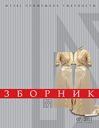
DRAGINJA MASKARELI
VENČANE HALJINE U SRBIJI U DRUGOJ POLOVINI XIX I POČETKOM XX VEKA IZ KOLEKCIJE MUZEJA PRIMENJENE UMETNOSTI U BEOGRADU
WEDDING DRESSES IN SERBIA IN THE SECOND HALF OF THE 19th AND THE BEGINNING OF 20th CENTURY FROM THE COLLECTION OF THE MUSEUM OF APPLIED ART IN BELGRADE
WEDDING DRESSES IN SERBIA IN THE SECOND HALF OF THE 19th AND THE BEGINNING OF 20th CENTURY FROM THE COLLECTION OF THE MUSEUM OF APPLIED ART IN BELGRADE
Abstract (original language):
Odsek za tekstil i kostim Muzeja primenjene umetnosti u Beogradu predstavlja devet venčanih haljina iz svoje kolekcije. Reč je o haljinama koje su nastale u periodu između 1878. i 1914. godine i koje su pripadnice srpskog građanskog društva nosile kao venčane haljine, ali i u drugim prilikama vezanim za obred venčanja (npr. veridba). Među sačuvanim haljinama nalaze se bindali (bindall) haljine karakteristične za osmanski kostim, zatim haljine sašivene u Srbiji po uzoru na evropsku modu, kao i haljine sašivene u Evropi (Venecija, Beč, Pariz). Osvrćući se na proces transformacije odevanja srpske građanske klase od orijentalnog ka evropskom modnom obrascu, cilj ovog teksta je da haljine iz kolekcije sagleda u stilskom, društvenom i istorijskom kontekstu vremena u kome su nastale.
Key words (original language):
venčane haljine, građanski kostim, kolekcija, moda, Muzej primenjene umetnosti, odevanje, Srbija XIX vek, Srbija XX vek
Summary:
The clothing of the Serbian middle-class, or bourgeoisie, in the 19th century went through a process of transformation from Oriental garments to European modern costume. The European influence in the clothing of the Serbian bourgeoisie is evident from the 1850s and dominant after the 1870s. The nine dresses kept in the female costume collection of the Costume and Textile Department of the Museum of Applied Art in Belgrade can be observed within the context of this process of transformation. They were worn by middle-class women as wedding dresses or on other occasions related to weddings (e.g. engagement celebrations). Among these preserved dresses, dating from 1878 to 1914, there are bindalli dresses characteristic of Ottoman attire, then dresses made in Serbia after the patterns of European fashion, as well as dresses made in Europe.
KATARINA NINA SIMONČIČ
ODJEVNA PROIZVODNJA ZAGREBA U RAZDOBLJU SECESIJE
THE CLOTHING PRODUCTION IN ZAGREB IN THE SECESSION PERIOD
THE CLOTHING PRODUCTION IN ZAGREB IN THE SECESSION PERIOD
Abstract (original language):
Rad istražuje i donosi pregled zagrebačke tekstilne proizvodnje razdoblja secesije. Naglasak rada je na modnim oblicima namijenjenim ženama čija je osnovna uloga bila, odjevnim izgledom, ukazati na financijsku moć supruga. Proizvodnja i prodaja odjevnog asortimana smješta se u dvije glavne zagrebačke ulice gdje se uz domaće modne oblike nalaze i inozemni artikli. Osim prvih tekstilnih tvornica, značajnu ulogu o oblikovanju zagrebačkog modnog stila imaju modni krojači školovani u inozemstvu. Svojim modnim izričajem koji prati europske modne tokove, oblikuju vlastiti stil, te ujedno aktivnim društvenim angažmanom doprinose boljem položaju obrtnika - krojača. Zagrebačka moda bila je pod jakim utjecajem triju modnih centara: Pariza, Beča i Londona, kako u stilskom izričaju, tako i u načinu prezentiranja mode na onodobnim društvenim okupljalištima. Najznačajniji doprinos u oblikovanju zagrebačke mode ipak ima Pariz, na što ukazuje modni tisak, ponuda pariškog asortimana, te odjevni oblici proizašli iz zagrebačkih modnih salona. Istraživanje se temelji na relevantnoj povijesnoj literaturi, istraživanju podataka u državnom povijesnom arhivu, onodobnom modnom tisku, te sačuvanim odjevnim predmetima. Podaci se analiziraju i uspoređuju u cilju povijesnog pregleda do sada neistraženog segmenta. Svrha rada je ukazati na početak otvaranja modnih poslovnica u dvije glavne zagrebačke ulice na čijim se povijesnim lokacijama proizvodnja i prodaja mode zadržala i tijekom XX stoljeća, te ujedno na mali zagrebački doprinos europskoj modnoj slici početka XX stoljeća kroz proizvodnju Industrije Salamona Bergera.
Key words (original language):
Gjuro Matić, moda secesije, modni krojači, modni saloni, Salamon Berger, tekstilne tvornice, zagrebačka moda
Summary:
The fashion in Zagreb at the turn of the 19th century was under strong influence of Paris and Vienna. Zagreb, within the Austro-Hungarian empire, aspires to the culture and fashion of Vienna where the emphasis was on ready-made clothing production. Paris was oriented towards haute couture during the period of Secession, thus becoming the crucial point as regards trading routes and fashion impacts. It was in 1895 that Zagreb symbolically gave the title Parižka moda (Parisian Fashion) to its first fashion journal in Croatian.
This paper focuses on two Zagreb central streets which tailored, produced, presented and traded fashion. Textile production places, fashion salons, fashion tailors as well as textile and clothing assortments of home and foreign provenance are described. Due attention is paid to the fashion press of the period, which used to note fashion events, gatherings, presentation spaces and in the same time to inform about fashion trends. Significant source of information for the reconstruction of clothing production in Zagreb offered advertisements published in the press placed by fashion houses, stores, factories and tradesmen. Their offers included dress items, accessories, and specialised terms for various fabrics.
The emphasis in the paper is on comparative researches both of Zagreb fashion and of other centres so that a comprehensive insight into the fashion development in the area may be accomplished. Women's fashion is described to a large extent since the press paid greater attention to it. The clothing of a woman expressed her husband's financial standing and it also served as status indicator related to young unmarried women. Like all bigger capitals, Zagreb also had ladies representing fashion. They either belonged to nobility or were opera divas and actresses. The Zagreb fashion in the period of Secession was most deeply marked by the work of Gjuro Matič, fashion tailor trained in Paris as well as by contribution of the Industry of Salomon Berger, which by applying traditional elements on the fashion clothing shaped the autochthonous expression present in foreign markets also.
DUŠANKA PIHLER
BLUE JEANS : VIŠESTRUKA ZNAČENJA PORUKA U POPULARNOJ KULTURI
BLUE JEANS : THE MULTIPLE MEANINGS OF MESSAGES IN POPULAR CULTURE
BLUE JEANS : THE MULTIPLE MEANINGS OF MESSAGES IN POPULAR CULTURE
Abstract (original language):
Blue jeans, prešavši put od teške industrije do visoke mode, tokom XX veka je postao jedan od najprilagodljivijih odevnih predmeta, prisutan u svim modnim stilovima širom sveta. Danas, masovno prihvaćen odevni predmet od plavog teksasa, koji gotovo da predstavlja uniformu u srednjim školama i na fakultetima, tokom svoje evolucije sadržao je mnogobrojne različite poruke i funkcionisao na različite načine. U ovom radu će se analizirati nastanak, komercijalizacija i popularizacija ovog odevnog predmeta u okviru američke popularne kulture, zatim njegova stilizacija i promene dizajnerskih karakteristika koje služe kao suptilan i precizan pokazatelj kretanja i promena u savremenoj popularnoj kulturi i društvu, putem čega će se hronološki ispitati višestruki slojevi značenja blue jeans -a, koji od simbola demokratije, utilitarnosti i besklasnosti, preko simbola pobune i pogodnog medija za ličnu kreativnost, postaje amblem aktuelnosti, statusni simbol stila, kao i potvrda tradicionalnog ukusa i hijerarhijskih podela.
Key words (original language):
blue jeans, brend, identitet, moda, popularna kultura, teksas platno
Summary:
In the 20th century blue jeans became the most popular artifact of popular culture, an item of clothing accepted en masse and an integral part of the entire American and global scene. This text makes a parallel analysis of their first appearance, commercialization and popularization, the changes in design and the multiple layers of meaning during their evolution. Since they were able to adapt to the needs, fashion styles and tastes throughout the world, blue jeans went through a process of cultural authenticity in which fashion, global markets and mass media intervened in the transformation of this item of clothing and endowed it with symbolic and cultural meanings totally different from the original ones, thus providing a satisfactory medium for communicating the messages through the act of consumption. Although linked to hard work for a long time, blue jeans acquired a number of symbolic attributes during their evolution, and grew from a symbol of usefulness and democracy, over patriotism and equality to a symbol of revolt, resistance and generational conflict. In the 1960s they obliterated the regional, national and ideological differences as well as the borderlines between professions, classes, gender roles and age limits, and became globally accepted items of mass consumption. When they entered the postindustrial abundance of the West, they were absorbed by the dominant culture which continued their conformity to fashion styles by changing a number of the former outer signs, key concepts and symbolic allusions and, by means of the mass media Mass media", Oxford English Dictionary, online version November 2010, promoted new symbolic meanings which then reintroduced the differences between classes, hierarchical divisions and elitism. At the same time, there was a continuation of the tendency to emphasize the basic symbolism of the blue jeans, such as democracy, classless society, simplicity and unpretentiousness. The messages are mutated and mixed while blue jeans continue their evolution globally even in the 21st century.
JESSICA BUGG
THE CLOTHED BODY IN FASHION AND PERFORMANCE
TELO I ODEVANJE KAO PREDMET MODE I UMETNIČKE PREDSTAVE
TELO I ODEVANJE KAO PREDMET MODE I UMETNIČKE PREDSTAVE
Abstract:
This paper explores the clothed, communicating body as a site for the meeting of fashion and performance practice. It discusses the relationship between the body and clothing as a potentially shared form of communication in areas of contemporary fashion and performance practice and specifically investigates the symbiotic relationship between the two in conveying narratives and concepts from and on the body.
The methodology draws on an analysis of practice and theory in contemporary fashion and performance design, exposing cross disciplinary approaches and an interchange of ideas that point towards a hybrid practice between the two disciplines. By placing clothing at the centre of this debate it is possible to take into account how the emotional and physical factors as well as the site of the body itself contributes to the making, intention and reading of such work. It is suggested that this area of work could be seen as a type of body located scenographic practice in its own right.
The paper concludes that there are a range of embodied practices where practitioners work with materiality, clothing the body and conceptual approaches that seemingly function in cross disciplinary territory. Attempts to categorise within formal constructs can restrict creative progress and that it is through understanding the body as a site specific context that it is possible to move forward and give meaning to this practice in a contemporary context.
Key words:
the body as site, the clothed body, communication, conceptual, cross disciplinary, fashion and performance design, scenography
Summary (translated):
U tekstu se, sa aspekta dizajnera, istražuje odeveno telo kao sredstvo komunikacije i mesto susreta mode i scenske predstave. Razmatrajući odnos tela i odeće kao moguće zajedničke forme komunikacije u savremenoj modi i na sceni, posebno se ispituje simbiotički odnos tela i odeće, kojim se narativi i sadržaji prenose sa tela i ka njemu.
Smeštajući odeću u žižu teoretske rasprave i prakse savremenog modnog i scenskog dizajna, uzimam u obzir način na koji emotivni i fizički činioci, uključujući i samo telo kao prostor, doprinose stvara- nju, nameri i čitanju takvih dela. Uverena sam da se ova oblast može posmatrati kao svojevrstan scenografski postupak na samom telu.
Smeštajući odeću u žižu teoretske rasprave i prakse savremenog modnog i scenskog dizajna, uzimam u obzir način na koji emotivni i fizički činioci, uključujući i samo telo kao prostor, doprinose stvara- nju, nameri i čitanju takvih dela. Uverena sam da se ova oblast može posmatrati kao svojevrstan scenografski postupak na samom telu.
DIMITRIJE LJ. MARINKOVIĆ
CIBORIJUMI U MANASTIRU ŽIČI
THE CIBORIA OF ŽIČA MONASTERY
THE CIBORIA OF ŽIČA MONASTERY
Abstract (original language):
Osnovni motiv teksta sadržan je u pokušaju da se ukaže na istorijsko poreklo oblika i forme ciborijuma, kao i na bogoslovske razloge koji su uticali na odabir modela za njihovu različitu primenu u manastiru Žiči. Kroz deskriptivnu metodu izneta je njihova arhitektonika, opisano je uobličavanje svih arhitektonskih elemenata komponovanja geometrije primenjenih oblika, kao i poreklo i obeležja uzora za uobličavanje njegovih pojedinosti, koji su nosioci likovnog jezika različitih epoha u kojima su nastajali.
Key words (original language):
agiazma, liturgijski nameštaj, oltar, proskinitar, sud za osveštanu vodu, fijala, ciborijum, crkva, časna trpeza
Summary:
Ciborium has been part of a temple ever since the oldest Christian communities started building their sanctuaries. Columns supporting domes make basic architectural structure of an altar. Size, material and richness of decoration of an altar ciborium and its lateral branches stood always hand in hand with the significance of a temple and with the financial power of the endower.
In 1206-1217, king Stefan the First-Crowned and Saint Sava I Serb built the catholicon of the Ascension of Our Lord Church in Žiča Monastery which had been the seat of Serbian archbishopric and the coronation church. After completion of the building works, Saint Sava had the interior of the temple decorated. The original altar septum was carved and placed between eastern dome pilasters. Deep proskynetaria (προσκυνητήριον) stood in front of their western sides facing the naos. In her studies and interpretations of the older altar septum, Milka Čanak-Medić offered a hypothetical reconstruction of its lateral branches shaped as proskynetarion whose construction was similar to that of a ciborium. Judging by the position and shape of their lines and by the degree of the transept shift from its transversal axis towards west, it may be assumed that the original temple design required the placement of the ciboria to allow for a deep space in front of the altar septum housing the ceremonial and very important stone furniture. It is possible that the base of this proskynetarion – ciborium of Žiča served also as cover for the holy items and not only as a flanking to the main icons.
In the late 1930s a phiale – ciborium over piscina, designed by famous Serbian architect Momir Korunović, was built in the southwest part of the courtyard of the ancient Žiča Monastery. Nikolaj Velimirović, in his capacity as bishop of Žiča, engaged vigorously in building activities in the monastery. Renovation and decoration of Žiča included the erecting of the phiale very probably in 1939. It was built to the southeast of the altar apse in the Church of the Ascension and was intended for the piscine below to keep the blessed water for Epiphany. In the estate of architect Momir Korunović there remained a drawing of the Žiča phiale. The executed phiale of harmonious and well-thought-out proportions, must have resulted from another, more developed and decorative idea of Korunović whose drawings and reasons for their development we do not know. If compared to locations of known identical ciboria in the Holy Mount monasteries, which are placed mainly in the forefront of the church and stretching to the west along the transversal axis of temples, it must be noted that the place of the Žiča phiale is unusual, as it is sidelined in relation to the existing monastery buildings. Reasons for the decision to place it in the part of the churchyard beyond the reach of usual liturgy practice are not clear. Regardless of these shortcomings, of inadequate and more recent colour interventions on its metal sheet surfaces and of lack of care for the original polychrome of the architectural plastic which is saved only in traces, the phiale of Žiča, although out of service now, certainly represents an attempt to reinterpret models of the Holy Mount which has been proved to be more successful in the field of architecture and shape than in practising liturgy.
The bishop of Žiča, Hrizostom (Stolić), initiated placing of the altar ciborium, work of architect Dimitrije Lj. Marinković, in the Church of Ascension in Žiča Monastery in 2006. The altar ciborium was not to allow its columns to touch the existing holy table at its corners where bloodless sacrifice is offered in glory of Jesus Christ during liturgy (1 Corinthians 10:18-21; Hebrews 13:10). The analysis of the architectural design of the ciborium indicated certain differences and deviations regarding details between the project and final execution of this liturgical instrument. The endeavour in the Church of Ascension in Žiča Monastery is ever more important since it meant intervention achieved by interpolation of contemporary liturgical instruments in the inside of an object registered as national cultural and historical monument of great importance. The position of a contemporary altar ciborium did not represent threat to the existing holy table since its bottom in the lower part of the ciborium remained untouched. The horizontal dimensions of the ciborium were determined with regard to liturgical requirements related to the central part of the altar space. Its vertical dimensions were adapted to the volume of the altar, allowing good visibility of preserved frescoes in the altar. It is most important though that the Žiča altar ciborium serves its essential task rather than the architectural one. This, however, did not prevent its basic forms and all the assorting details to be designed with greatest care as if it had been an altar ciborium with no visual impediment in the front.
DRAGANA VASILJEVIĆ TOMIĆ
BOJA U PROSTORU : KOLORISTIČKA KULTURA
COLOUR IN SPACE : COLOURISTIC CULTURE
COLOUR IN SPACE : COLOURISTIC CULTURE
Abstract (original language):
Istorijska arhitektonska polihromija predstavlja osnovu za pojavu boje u javnom prostoru. Kompleksnost kolorističkih odlika javnog gradskog prostora uslovljena je osnovnim karakteristikama: kolorističkim prioritetima, harmonijom bojenih prostornih struktura i materijala u projektovanju polihromnih ambijenata u gradu. Faktori koji oblikuju koloristički ambijent grada jesu: prirodne i klimatske karakteristike, međuodnosi boje i oblika, kao i doživljaj forme javnog gradskog prostora uz očuvanje njegovog identiteta. Fenomen boje ispitan je kroz evoluciju boje i razvoj kolorističke kulture, koja značajno utiče na kolorističke prioritete ljudi i samu koloristiku grada. Termini funkcionalna boja i klima boje takođe su razmatrani kao neke od najbitnijih odlika arhitektonske i urbanističke prakse. Kvalitet javnog gradskog prostora direktno je uslovljen kulturnim identitetom, a posredno pojavom polihromije u javnom gradskom prostoru. Potreba za unapređenjem kvaliteta života u gradu predstavlja jedan od ključnih motiva za bavljenje urbanim prostorom, odnosno započinjanje procesa arhitektonsko urbanističkog projektovanja. Prikupljena iskustva ukazuju na mogućnost redefinisanja koncepta javnog gradskog prostora u planersko-projektantskoj praksi. Sintetisano znanje profinjeno je ispitivanjem elastičnosti njegovih granica u skladu sa očuvanjem identiteta mesta i budućim transformacijama grada i njegovih korisnika. Formirani su novi principi na kojima je izgrađen transformisani model javnog gradskog prostora kao polihromnog ambijenta.1
Key words (original language):
boja, koloristička kultura, koloristička harmonizacija, koloristički ambijent grada, koloristički prioriteti, komponovanje arhitektonske forme
Summary:
The complexity of colouristic space is conditioned by its basic characteristics: colouristic priorities, harmony of painted space structures and material used in design of polychrome ambiences of a town.
The limits of colouristic culture define the epoch and the geographical frame it exists in. The impact of regional centres can be singled out, where the colouristic canons develop and disappear, and the colouristic traditions mature tending to expand beyond geographical boundaries. Agents, having impact on formation and expansion of colouristic culture belong to the realm of natural-climatic, psychological and historical-cultural features. Elements of colouristic culture include colour manifestations on the material world objects, which reflect colouristic symbolism and philosophical understanding of the colour.
Modern man's vision has changed. Our time and its tempo of life, speed of perception, technical innovations, film, most often require a synthetic vision of things and colours. Achievements of the colouristic culture – creative experience and results of scientific research – are used in various countries in order to create in a colouristic manner the surrounding object-space environment. Professional tasks within the frame of this approach often neglect the psychological and cultural aspects of architecture. It is obvious that when colour is used in an architectural space the need for improvement of architectural qualities of the space, its esthetic expression and creation of a pleasing psychological environment should be taken into consideration in relation to the kind of activities likely to take place. This justifies the ambience approach in projecting the colouristic features of a town, which is a combination of space and social requirements.
The basic issue of colouristic harmonization of town ambience is to connect colouristic harmonization of architectural spatial structure with perceptions in move which actually prevents the functioning of harmonization methods of colouristic surface compositions. The colouristic harmonization of town ambience is a task requiring far more complex level in relation to harmonization of colours on a surface and necessity to experience colours in space. It is determined by the level of development of colouristic culture, social status and can be successfully solved in the process of architectural urban design through the use of new generation colouristic systems as instruments of harmonization.
Composition of colours in an architectural setting requires the attention to be focused on conditions defined by actual spatial-plan situation. That is, changes of colours should emphasize the compositional implications of spatial framework in objects, rhythmical patterns of their mutual relation in space and comparison of dimensions. The colour is experienced as a secondary architectural means emphasizing the compositional concept which developed without colours.
The significance of architectural polychrome is sublimated in the information contained in the architectural form, nature, society, ways of the social life and culture. Knowledge of the architectural polychrome language is an indispensable element of colouristic compositional skills enabling the polychrome to be used in providing meaningful, emotional, and ideological sense of architecture. Relation to colour has a solid, cultural-historical base encompassing the symbolism of colours and reliable correlation between people when colour semantics is concerned. Expressiveness of the polychrome, its ability to pass information on the importance of architecture and to provoke emotional reactions and esthetic experience, offer possibility for discussion on colours within the frame of a given historical-cultural human community.
The language of colours expands the artisticmeaningful potential of architecture. The language of colours actively influences thoughts and feelings of people by provoking emotional reactions and experiences.
TANJA VIĆENTIĆ
OSVRT NA ZBIRKU SAVREMENE UMETNIČKE KERAMIKE NARODNOG MUZEJA U ARANĐELOVCU
Retrospektivna izložba radova „Sveta keramike“
NOTE ON THE COLLECTION OF CONTEMPORARY ART CERAMICS OF THE NATIONAL MUSEUM IN ARANDJELOVAC
Retrospective Exhibition “In the World of Ceramics”
Retrospektivna izložba radova „Sveta keramike“
NOTE ON THE COLLECTION OF CONTEMPORARY ART CERAMICS OF THE NATIONAL MUSEUM IN ARANDJELOVAC
Retrospective Exhibition “In the World of Ceramics”
Abstract (original language):
Ovaj rad je osvrt na bogatu i dragocenu zbirku savremene umetničke keramike Narodnog muzeja u Aranđelovcu koja je nastajala na međunarodnom festivalu „Svet keramike“ u okviru Smotre umetnosti „Mermer i zvuci“. U radu je ukazano na značaj ove kolekcije, u kojoj se kroz skoro pune četiri decenije, sabrao vredan materijal za sagledavanje opštih kretanja, promena i novih tendencija u savremenoj umetničkoj keramici od sedamdesetih godina XX veka do danas. Ujedno, dat je i prikaz retrospektivne izložbe u Narodnom muzeju u Aranđelovcu.
Key words (original language):
zbirka, Narodni muzej u Aranđelovcu, retrospektivna izložba, savremena umetnička keramika, „Svet keramike”, simpozijum
Summary:
This most valuable collection of contemporary art ceramics of the National Museum in Arandjelovac originated from the international festival “World of Ceramics” within the frames of the internationally renowned multimedia manifestation “Marble and Sounds”. The collection houses over 600 exhibits. Until the year 2010, works of 258 national and foreign artists including those from former YU republics had become part of the collection. Due to the lack of adequate space and professional staff, the process of designing the collection could not begin in the first years of the festival. However, the engagement of the Museum of Arandjelovac in the 1980s enabled collecting of objects, museum processing of items and establishment of necessary documentation. This collection represents a most significant segment of general changes, trends and new tendencies in contemporary Yugoslav and Serbian art ceramics from the 1970s until the present.
In the study of the collection of contemporary art ceramics of the National Museum in Arandjelovac a complex approach is required ranging from the research of specific elements that affect its formation – the general social, political and economic situation in the country, rules of selection and other yardsticks, including the genesis of the contemporary Serbian ceramics and diverse ways of its development – up to its historic-artistic evaluation within contemporary Serbian and world art. Fundamental deliberations may precede particular analyses of individual art works based on esthetic values categories, styles, technical-technological achievements and specific phases in the creative opus of an artist. Complex investigations accompanying thematic and retrospective exhibitions help complete the picture of accomplishments in ceramic art.
The retrospective exhibition of contemporary art ceramics in the National Museum in Arandjelovac offers fifty five select works. The basic aim was to offer a synthesis of diverse artistic expressions, as well as patterns of thought and innovations developed within the period of almost four decades.
TATJANA DADIĆ DINULOVIĆ
IZLOG KAO POZORNICA
STORE WINDOW AS THEATRE STAGE
STORE WINDOW AS THEATRE STAGE
Abstract (original language):
U vreme masovne proizvodnje i potrošnje svega, pa i umetničkih dela, kada tržište u celini preuzima logiku, sredstva i karakter pozorišta i primenjuje ih u svakom aspektu savremenog života, teatralizacija komercijalnih izloga postaje paradigma „društva spektakla“. Proces građenja identiteta prodavnice komercijalne robe zasnovan je na ukupnoj ideologiji robne marke ili uspostavljanju slike o životnom stilu koji ta robna marka zastupa. Postajući značajan deo ukupne scenografske slike prostora ispred i iza „kulisa“, „scena“ u izlogu prodavnice komercijalne robe liči na pravi scenski prostor, postajući mesto ubeđivanja i zadovoljavanja mašte kupaca. Istovremeno, autentični izraz izloga zanatske radnje, bez obzira na činjenicu da nije daleko vreme u kome će u stvarnom životu savremenog grada ovakav izlog prestati da postoji, ostaje trajna vrednost i primer koji govori o mogućoj organskoj vezi između proizvodnje i predstavljanja. Identitet zanatske radnje zasnovan je na vrednostima proizvoda, ideologiji zanatske proizvodnje i politici prodaje, a odlikuje ga uspostavljanje jedinstvene celine u odnosu na vizuelni identitet, poruke i okruženje. Izloženi predmeti, zahvaljujući svojim oblicima, svojstvima materijala od kojih su načinjeni, boji, kao i međusobnim prostornim odnosima, grade ambijent u kome, bez prethodne namere, proizvod stiče scensku vrednost. Upoređujući filozofije izlaganja, a zatim i građenja identiteta dve podvrste izloga kao pozorišta, razmotrićemo specifičnosti ovog fenomena.
Key words (original language):
vizuelna trgovina, dizajn izloga, zanatska radnja, izlog, prodavnica komercijalne robe, scenski dizajn, urbana komunikacija
Summary:
Although today we can consider each space–time unit as a space of spectacle, contemporary city becomes a dominant spatial framework for different stage phenomena. In the time of mass production and consumption of everything, including the works of art, when market takes over the logic, means and character of the theatre and applies them to every aspect of contemporary life, theatricality of commercial shop windows becomes a paradigm of „the society of spectacle“. The philosophy of commodities display assumes a significant use of stage tools. By linking visual merchandising with the overall profit of a shop, the concept of commodity presentation acquires a stage value or intentional scenic quality that directly and unambiguously enters in the service of the consumer society. This is why the identity building process of a commercial shop is based on the overall ideology of a brand name or the constitution of the image of the life style represented by that brand. In becoming a significant part of the entire stage design image of the space in front and behind the „set“, the „scene“ in the window of a commercial shop resembles the real stage space and becomes the place of persuasion and satisfaction of the consumers' imagination. At the same time, an authentic expression of an artisanal shop window, notwithstanding the fact that soon such a window will no longer exist in the real life of a contemporary city, remains a lasting value and an example of a possible organic link between the producer, the product, the presenter and representation. The business philosophy of a traditional artisanal shop assumes a specific way of display – the artisan himself not only creates the product but also places it in the window and the product thus becomes the means of representation. With their shapes, the properties of the material, colour and spatial interrelations, the displayed objects create an ambience in which the product itself unintentionally incurs a scenic value. Such a shop window can establish communication through its closeness and create a specific relationship between the „stage“ and the „auditorium“. An artisanal shop window thus becomes the paradigm of integrated approach to the process of production and presentation.
ALEKSANDAR KADIJEVIĆ
DUŠAN MILOVANOVIĆ
Draginja Maskareli
AKVIZICIJE MPU
ACQUISITIONS MAA
ACQUISITIONS MAA
MILAN ANDRIĆ
SRĐAN RAKONJAC
ANDRIJANA RISTIĆ