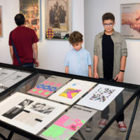
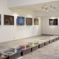
MAŠIĆ - Slobodan Mašić Visual Communications Retrospective Exhibition
Curator of the Exhibition: Slobodan Jovanović, Museum of Applied Art
Design of the visual identity of the Exhibition: Borut Vild
Already at the end of the 1960s, Mašić defined his poetics, in the first place by creating of famous ideograms, such as star inscribed into circle (the logo of Studio Struktura) or ideogram comprised of counter directed vertical arrows (the logo of Independent Editions). His ability to manipulate graphic design enabled him to analyze contents of communication, reducing them to their symbolic essences. Without excess pictoriality, he constructs surfaces, which become transmitters of the meaning of the content of a poster, a book or other means of visual communication. He used the simple spatial composition, found in the poster for Dom omladine, later on, in order to represent the rhythm of recurring signs. This rhythm allows him to create new world image in which his signs create special graphic language, which escapes the figural to reach the symbolic and the iconic.
In the text „In Search for His Expression“, in the catalogue of the exhibition MAŠIĆ, Miroslav A. Mušić states that „he was superior in expressing his attitudes. He went from the notion that each graphic sign, line and white area has their place, symbolism, and rationale. With his ability to extract, he entered a dialogue with the world. Those were critical reflections done with graphic language with the tendency to express an opinion about certain values, misapprehensions or utopias.“


